Dark mode is no longer a nice-to-have. In 2025, it’s an expected baseline in modern web and app design.
As users grow more conscious of screen fatigue, battery life, and visual accessibility, what started as a trend has shifted to a core UX principle.
The Momentum Behind Dark Mode
- 82% of mobile users now prefer interfaces with a darker theme.
- Platforms like iOS, Android, Windows, and macOS offer native toggles.
- Major browsers support the CSS prefers-color-scheme media query.
- Brands like YouTube, GitHub, Twitter, and Figma have made it a default or dynamic option.
What Developers and Designers Are Doing in 2025
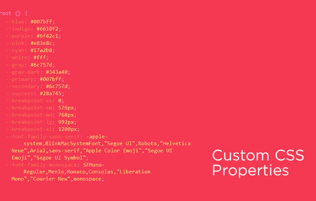
Using System-Level Preference Detection
cssCopyEdit@media (prefers-color-scheme: dark) {
  body {
    background-color: #121212;
    color: #e0e0e0;
  }
}
With just a few lines of CSS, websites can automatically adapt to user preferences.
Avoiding Pure Black (#000) and White (#fff)
Use rich grays (#121212, #1E1E1E) and soft off-whites (#E0E0E0) to reduce harsh contrast and improve readability. This approach also helps prevent visual fatigue, especially on OLED screens.
Reworking Entire Design Systems
Create parallel design tokens and color variables to support both light and dark mode. Adapt icons, illustrations, and imagery to ensure consistency across themes. Additionally, consider depth, elevation, and shadow to maintain a clear visual hierarchy.
Accessibility First
To ensure accessibility, maintain a minimum 4.5:1 contrast ratio for text and UI elements. Use testing tools like axe DevTools or Lighthouse to verify compliance, and make sure color choices are easily readable for users with low vision or color blindness.
Performance and Sustainability Gain
Darker backgrounds on OLED displays boost battery life by consuming significantly less energy. This sustainable design approach aligns with eco-conscious product strategies. Additionally, darker UIs reduce screen glare, minimizing cognitive load and helping users focus on content.
What’s Coming Next?
- AI-based theming: Auto-adjusting UI themes based on time of day or user behavior.
- Mood-based theming: Apps tailoring colors to emotions or productivity states.
- Dark mode first design systems: Some platforms now build exclusively for darker themes, retrofitting light themes later.
Final Takeaway
The shift to a darker interface in 2025 isn’t just about aesthetics — it’s about accessibility, energy efficiency, and user respect.. Whether you build apps, websites, or platforms, dark mode support is now a fundamental part of good UX.
Are you designing for dark mode yet? At EMOTIONStudios, we’ve already implemented dark mode on our website, and we can help you achieve the same seamless experience for your platform. Let’s create an accessible, user-friendly design together!